pacman::p_load(ggiraph, plotly, patchwork, DT, tidyverse) Hands-on Exercise 3
Getting started
- Using p_load() of pacman package to load the required libraries
- Importing data
exam_data <- read_csv("data/Exam_data.csv")Plotting the graph
1) Interactive Data Visualization with ggiraph
Student ID will appear when the mouse hovered to the specific data point.
Output:
p <-ggplot(data=exam_data,
       aes(x = MATHS)) +
    geom_dotplot_interactive(
       aes(tooltip = ID),
       stackgroups = TRUE,
       binwidth = 1,
       method = "histodot") +
       scale_y_continuous(NULL, breaks = NULL)

    girafe(
       ggobj = p,
       width_svg = 6,
       height_svg = 6*0.618
             )
1.1) Displaying multiple information with tooltip
Student ID and Class will appear when the mouse hovered to the specific data point.
Output:
exam_data$tooltip <- c(paste0(
  "Name = ", exam_data$ID,
  "\n Class = ", exam_data$CLASS))

p <- ggplot(data=exam_data,
       aes(x = MATHS)) +
     geom_dotplot_interactive(
       aes(tooltip = exam_data$tooltip),
       stackgroups = TRUE,
       binwidth = 1,
       method = "histodot") +
       scale_y_continuous(NULL, breaks = NULL)

     girafe(
       ggobj = p,
       width_svg = 8,
       height_svg = 8*0.618
           )
1.2) Customizing tooltip style
When the mouse hovered to the specific data point, the student ID will appear. We will customize the output to black and bold font with white background.
Output:
tooltip_css <- "background-color:white; #<<
font-style:bold; color:black;" #<<

p <- ggplot(data=exam_data,
       aes(x = MATHS)) +
     geom_dotplot_interactive(
       aes(tooltip = ID),
       stackgroups = TRUE,
       binwidth = 1,
       method = "histodot") +
       scale_y_continuous(NULL,
                     breaks = NULL)
    girafe(
      ggobj = p,
      width_svg = 6,
      height_svg = 6*0.618,
      options = list(    #<<
      opts_tooltip(    #<<
      css = tooltip_css)) #<<
          )
1.3) Displaying statistics with tooltip
When the mouse hovered to the specific data point, statistics will appear. In the below output, confidence interval will be displayed at 90% CI.
Output:
tooltip <- function(y, ymax, accuracy = .01) {
  mean <- scales::number(y, accuracy = accuracy)
  sem <- scales::number(ymax - y, accuracy = accuracy)
  paste("Mean Maths Scores:", mean, "+/-", sem)
}

gg_point <- ggplot(data=exam_data,
                   aes(x = RACE),) +
            stat_summary(aes(y = MATHS,
                   tooltip = after_stat(
                  tooltip(y, ymax))),
            fun.data = "mean_se",
                  geom = GeomInteractiveCol,
                  fill = "light blue"
                  ) +
           stat_summary(aes(y = MATHS),
                 fun.data = mean_se,
                 geom = "errorbar", width = 0.2, linewidth = 0.2
                  )

           girafe(ggobj = gg_point,
               width_svg = 8,
               height_svg = 8*0.618)
1.4) Hover effect with data_id aesthetic
When the mouse hovered to the specific data point, data points that are associated with the data_id(CLASS) will be highlighted.
Output:
p <- ggplot(data=exam_data,
       aes(x = MATHS)) +
     geom_dotplot_interactive(
       aes(data_id = CLASS),
       stackgroups = TRUE,
       binwidth = 1,
       method = "histodot") +
     scale_y_continuous(NULL, breaks = NULL)

     girafe(
       ggobj = p,
       width_svg = 6,
       height_svg = 6*0.618
        )
1.5) Customizing Hover effect
Similar to 1.2, we will customize the Hover Effect with the help of CSS.
Output:
p <- ggplot(data=exam_data,
       aes(x = MATHS)) +
     geom_dotplot_interactive(
       aes(data_id = CLASS),
       stackgroups = TRUE,
       binwidth = 1,
       method = "histodot") +
     scale_y_continuous(NULL, breaks = NULL)

     girafe(
       ggobj = p,
       width_svg = 6,
       height_svg = 6*0.618,
       options = list(
       opts_hover(css = "fill: #202020;"),
       opts_hover_inv(css = "opacity:0.2;")
           )
             )
1.6) Combining tooltip and Hover Effect
In the below output, we will combine both Interactive Data Visualization. The respective data points and the associated points will be reflected.
Output:
p <- ggplot(data=exam_data,
       aes(x = MATHS)) +
     geom_dotplot_interactive(
       aes(tooltip = CLASS,
       data_id = CLASS),
       stackgroups = TRUE,
       binwidth = 1,
       method = "histodot") +
     scale_y_continuous(NULL, breaks = NULL)

     girafe(
       ggobj = p,
       width_svg = 6,
       height_svg = 6*0.618,
      options = list(
      opts_hover(css = "fill: #202020;"),
      opts_hover_inv(css = "opacity:0.2;")
         )
           )
1.7) Click effect with onclick
In the below output, a new window will open upon a click (hotlink interactivity)
Note: Click actions must be a string column
Output:
exam_data$onclick <- sprintf("window.open(\"%s%s\")",
"https://www.moe.gov.sg/schoolfinder?journey=Primary%20school",
as.character(exam_data$ID))

p <- ggplot(data=exam_data,
       aes(x = MATHS)) +
     geom_dotplot_interactive(
       aes(onclick = onclick),
       stackgroups = TRUE,
       binwidth = 1,
       method = "histodot") +
     scale_y_continuous(NULL, breaks = NULL)

     girafe(
       ggobj = p,
       width_svg = 6,
       height_svg = 6*0.618)
1.8) Coordinated multiple views
In the below output, the graph will be interactive. Hovering on one data point will reflect the corresponding data point. We will be using :
patchwork function [use inside girafe function]
ggiraph [use to create multiple views]
Note: data_id aesthetic is critical, tooltip aesthetic is optional
Output:
p1 <- ggplot(data=exam_data,
        aes(x = MATHS)) +
     geom_dotplot_interactive(
       aes(data_id = ID),
       stackgroups = TRUE,
       binwidth = 1,
       method = "histodot") +
     coord_cartesian(xlim=c(0,100)) +
     scale_y_continuous(NULL, breaks = NULL)

p2 <- ggplot(data=exam_data,
       aes(x = ENGLISH)) +
     geom_dotplot_interactive(
       aes(data_id = ID),
       stackgroups = TRUE,
       binwidth = 1,
       method = "histodot") +
     coord_cartesian(xlim=c(0,100)) +
     scale_y_continuous(NULL, breaks = NULL)

     girafe(code = print(p1 + p2),
       width_svg = 6,
       height_svg = 3,
       options = list(
         opts_hover(css = "fill: #202020;"),
         opts_hover_inv(css = "opacity:0.2;")
            )
          )
2) Interactive Data Visualization with plotly
There are two ways to create interactive graph through plotly:
plot_ly()
ggploty()
2.1) Create interactive scatter plot with plot_ly() method
In the below output, the interactive graph is created through plot_ ly().
Output:
plot_ly(data = exam_data,
             x = ~MATHS, y = ~ENGLISH)
2.2) Create interactive scatter plot with plot_ly() method
In the below output, the interactive graph is enhanced with the addition of RACE as a visual variable.
Output:
plot_ly(data = exam_data,
             x = ~MATHS, y = ~ENGLISH, color = ~RACE)
2.3) Create interactive scatter plot with ggplotly() method
In the below output, the interactive graph is created through ggplotly().
Output:
Note: only 1 additional line required (Line 7)
p <- ggplot(data=exam_data,
            aes(x = MATHS,
                y = ENGLISH)) +
     geom_point(size=1) +
    coord_cartesian(xlim=c(0,100), ylim=c(0,100))

ggplotly(p)
2.4) Coordinated multiple views with plotly
The coordinated linked graphs will be achieved in three steps:
Use highlight_key() of plotly as a shared data
Create two scatter plots through ggplot2 functions
Subplot() of plotly package used to place them side by side
Output:
d <- highlight_key(exam_data)

p1 <- ggplot(data=d,
         aes(x = MATHS, y = ENGLISH)) +
      geom_point(size=1) +
      coord_cartesian(xlim=c(0,100), ylim=c(0,100))

p2 <- ggplot(data=d,
         aes(x = MATHS, y = SCIENCE)) +
      geom_point(size=1) +
      coord_cartesian(xlim=c(0,100), ylim=c(0,100))

subplot(ggplotly(p1),
        ggplotly(p2))
Note to self: patchwork is not interactive in comparion but includes labelling
3) Interactive Data Visualization with crosstalk methods
It is an add-on to htmlwidgets package with cross-widget interactions.
3.1) Interactive Data Table: DT package
In the below output, the interactive data table is created through DT package.
Output:
DT::datatable(exam_data, class= "compact")3.2) Linked brushing crosstalk method
In the below output, the interactive data table is created through DT package.
Output:
d <- highlight_key(exam_data)

p <- ggplot(d,
       aes(ENGLISH, MATHS)) +
     geom_point(size=1) +
     coord_cartesian(xlim=c(0,100), ylim=c(0,100))

gg <- highlight(ggplotly(p),
                "plotly_selected")

crosstalk::bscols(gg,
                  DT::datatable(d),
                  widths = 5)
4) Animated Data Visualization with gganimate methods
gganimate is an extension of ggplot2 which includes animation and includes the following:
transition_()defines how the data should be spread out and how it relates to itself across time.view_()defines how the positional scales should change along the animation.shadow_()defines how data from other points in time should be presented in the given point in time.enter_()/exit_*()defines how new data should appear and how old data should disappear during the course of the animation.ease_aes()defines how different aesthetics should be eased during transitions.
Source
Prior to building the graph, we would need to:
- Using p_load() of pacman package to load the required libraries
pacman::p_load(readxl, gifski, gapminder,
plotly, gganimate, tidyverse)- Importing data
col <- c("Country", "Continent")
globalPop <- read_xls("data/GlobalPopulation.xls",
                      sheet="Data") %>%
  mutate_each_(funs(factor(.)), col) %>%
  mutate(Year = as.integer(Year))
4.1) Building a static population bubble plot
In the below output, basic ggplot2 functions are used to create a static bubble plot.
Output:
ggplot(globalPop,
       aes(x = Old, y = Young,
       size = Population,
       colour = Country)) +
  geom_point(alpha = 0.7,
       show.legend = FALSE) +
  scale_colour_manual(values = country_colors) +
  scale_size(range = c(2, 12)) +
  labs(title = 'Year: {frame_time}',
       x = '% Aged',
y = '% Young') 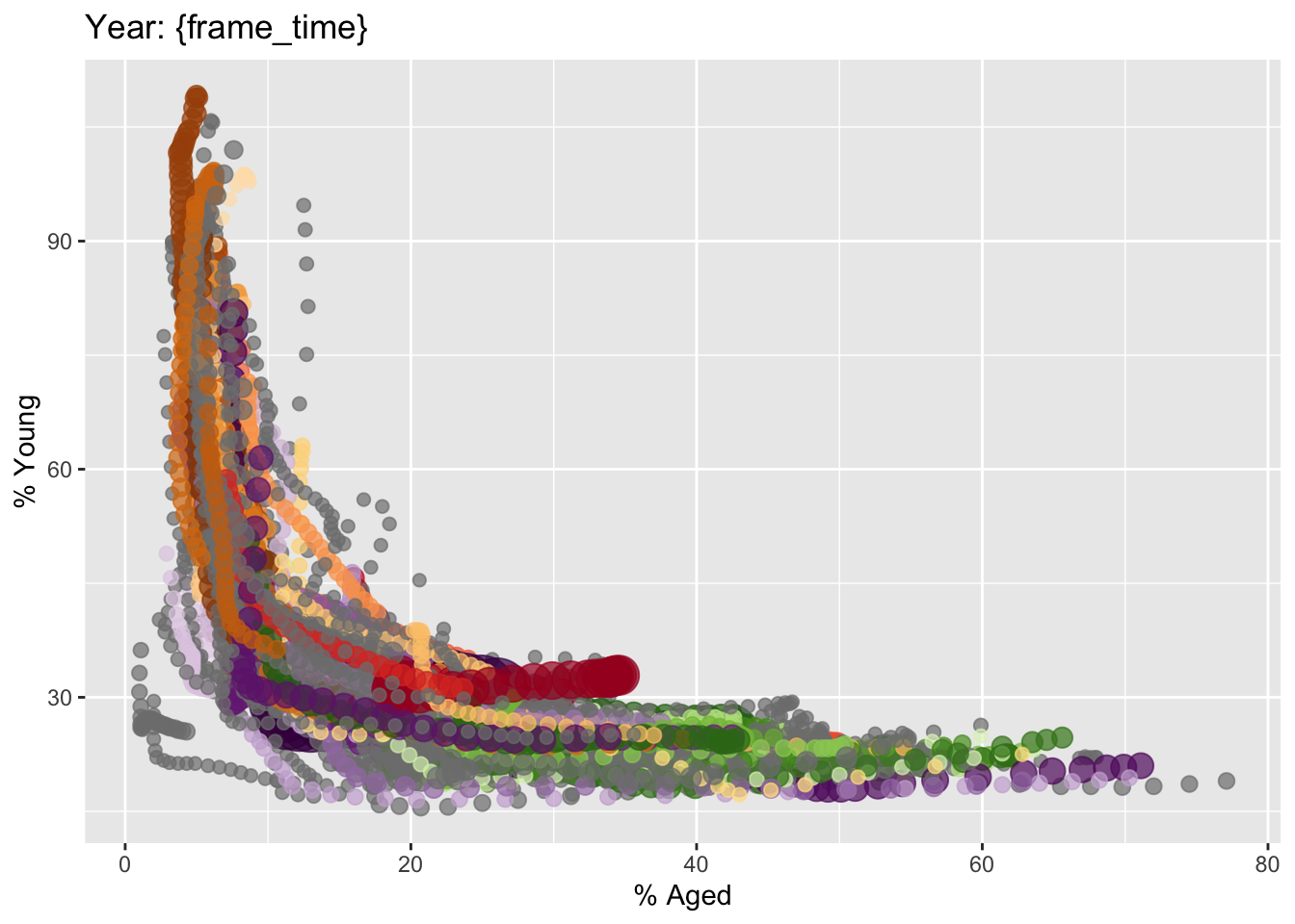
4.2) Building the animation bubble plot
Similar to 4.1, the below output will be animated.
Output:
ggplot(globalPop,
       aes(x = Old, y = Young,
       size = Population,
       colour = Country)) +
  geom_point(alpha = 0.7,
       show.legend = FALSE) +
  scale_colour_manual(values = country_colors) +
  scale_size(range = c(2, 12)) +
  labs(title = 'Year: {frame_time}',
       x = '% Aged',
       y = '% Young') +
  transition_time(Year) +
ease_aes('linear') 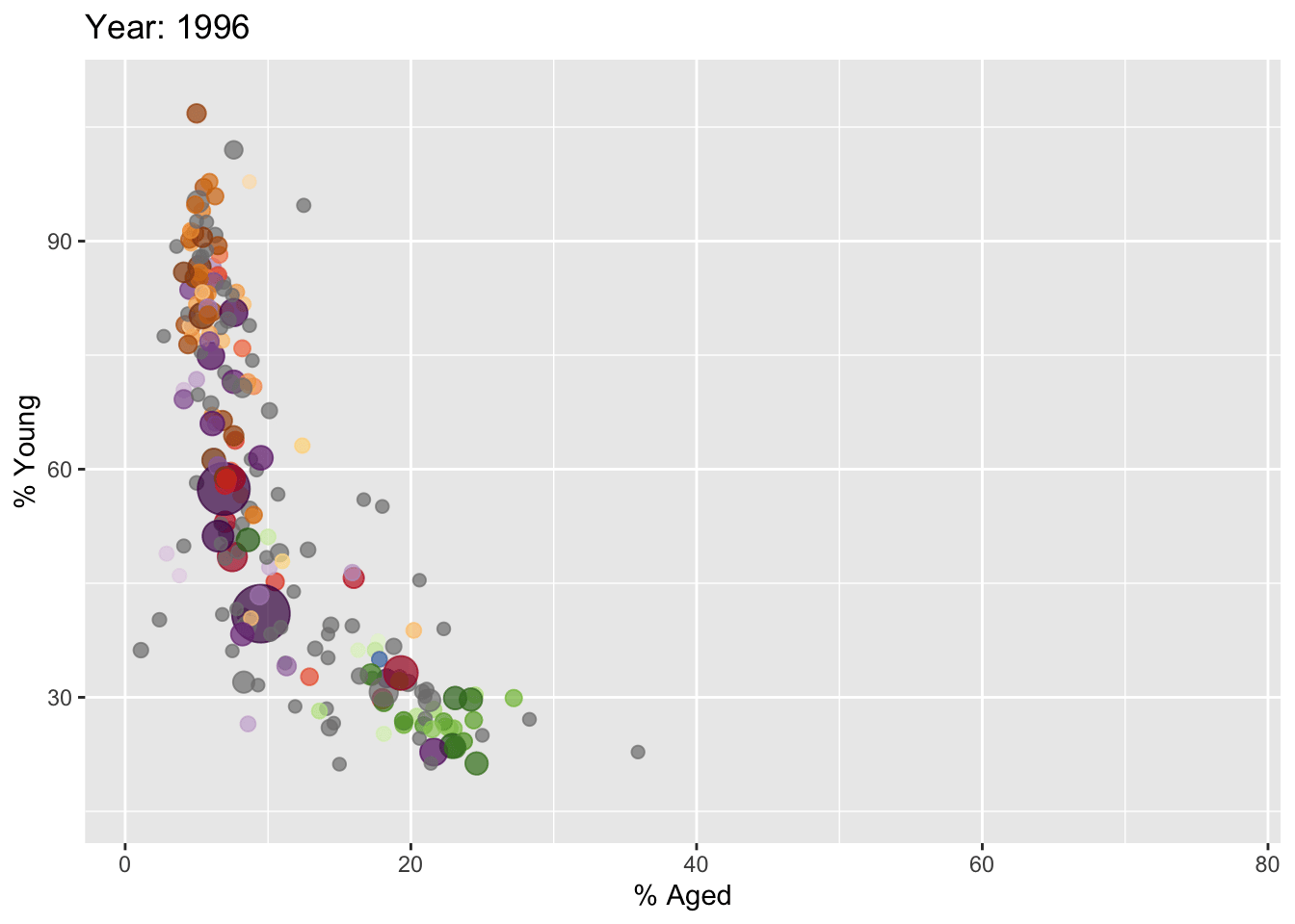
5) Animated Data Visualization with plotly methods
Similar to section 4, both ggplotly and plotly support animated data visualization.
5.1) Building an animated bubble plot plotly
In this sub-section, we will create an animated bubble plot..
Output:
bp <- globalPop %>%
  plot_ly(x = ~Old,
          y = ~Young,
          size = ~Population,
          color = ~Continent,
          frame = ~Year,
          text = ~Country,
          hoverinfo = "text",
          type = 'scatter',
          mode = 'markers'
          )
bp