pacman::p_load(corrplot, ggstatsplot, tidyverse, GGally,
parallelPlot, treemap, treemapify)Hands-on Exercise 6 Part Two
Getting started
- Using p_load() of pacman package to load the required libraries
- Importing Data
wine <- read_csv("data/wine_quality.csv")
realis2018 <- read_csv("data/realis2018.csv")
1. Plotting Correlation Matrix: pairs() method
Create a scatterplot matrix by using the pairs function of R Graphics.
1.1 Basic Correlation Matrix
pairs(wine[,1:11])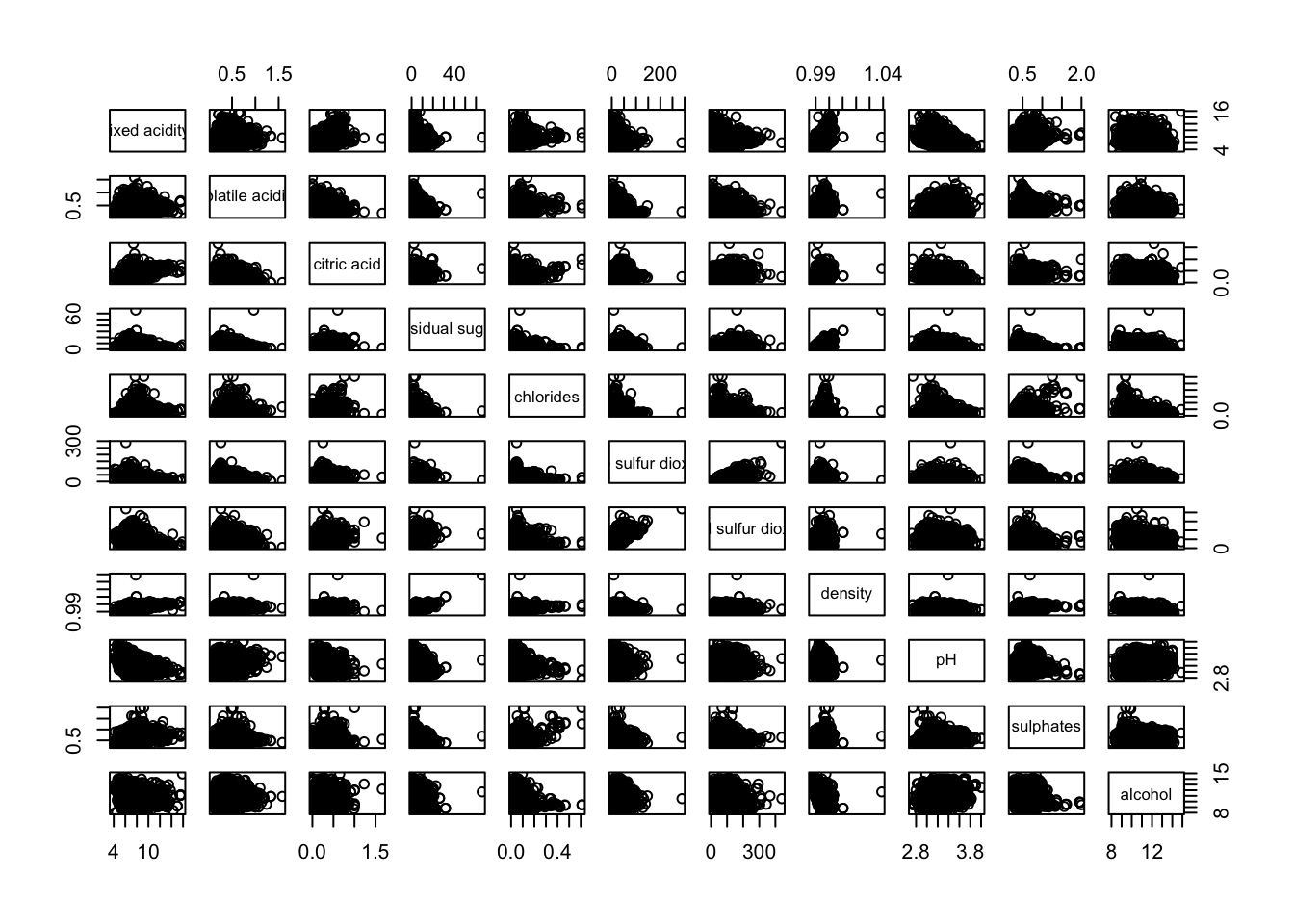
Another example. This time, it uses column 2 to 12 to the build the scatter plot matrix.
pairs(wine[,2:12])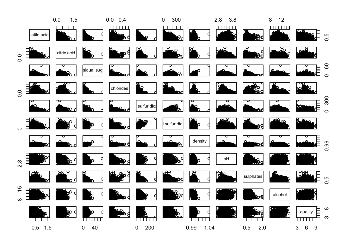
1.2 Lower Half of Correlation Matrix
Since correlation matrix is symmetric, we would like to see the lower half or upper half. Thus, we would need to choose between upper.panel = NULL or lower.panel = NULL .
pairs(wine[,2:12], upper.panel = NULL)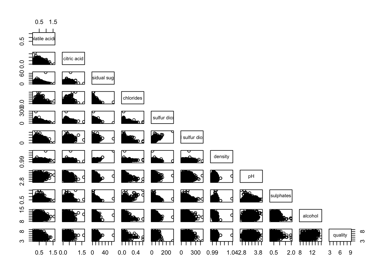
1.3 Show Correlation Coefficient
panel.cor function will be used to show the correlation coefficient of each pair of variables instead of a scatter plot.
panel.cor <- function(x, y, digits=2, prefix="", cex.cor, ...) {
usr <- par("usr")
on.exit(par(usr))
par(usr = c(0, 1, 0, 1))
r <- abs(cor(x, y, use="complete.obs"))
txt <- format(c(r, 0.123456789), digits=digits)[1]
txt <- paste(prefix, txt, sep="")
if(missing(cex.cor)) cex.cor <- 0.8/strwidth(txt)
text(0.5, 0.5, txt, cex = cex.cor * (1 + r) / 2)
}

pairs(wine[,2:12],
      upper.panel = panel.cor)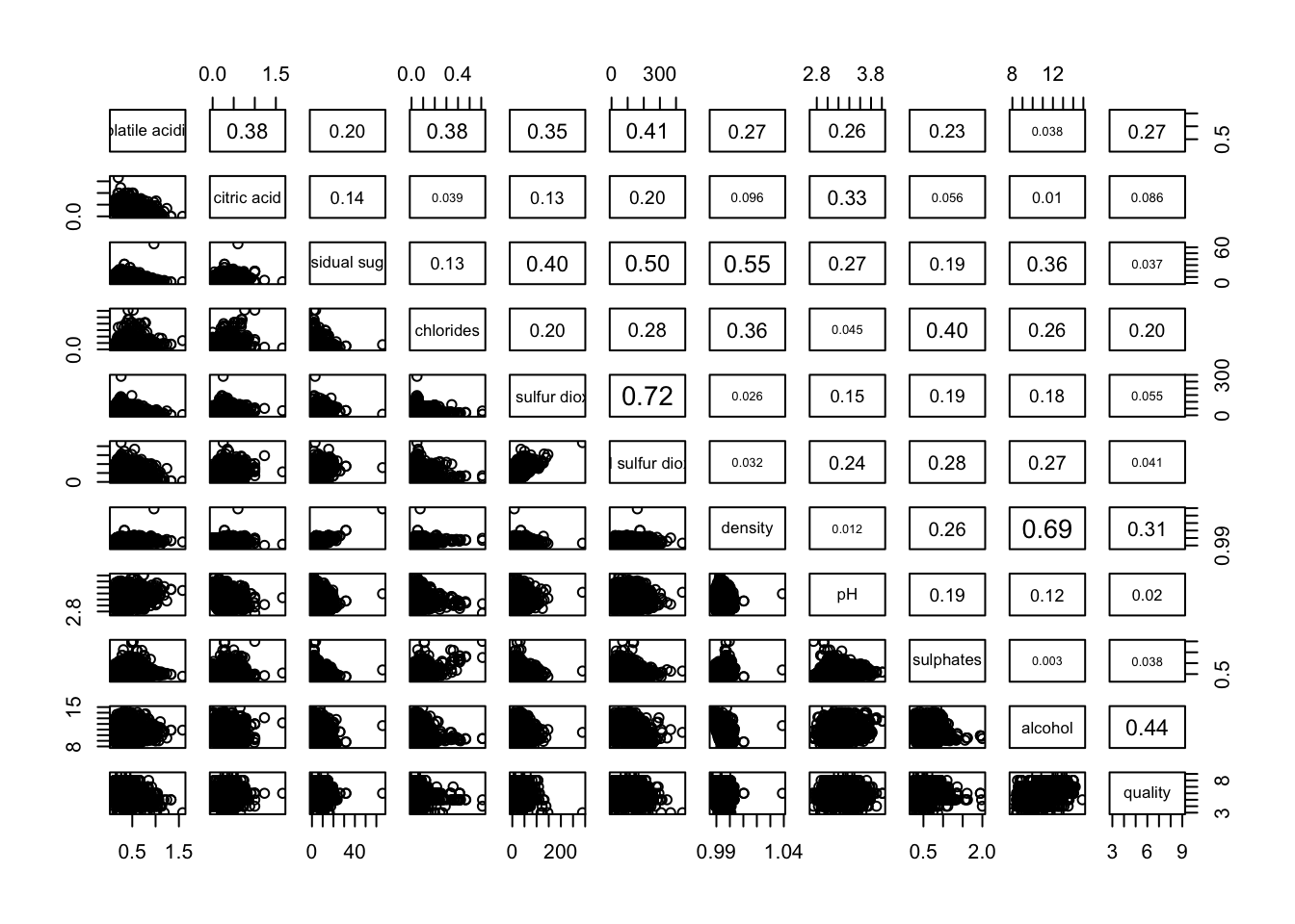
2. Plotting Correlation Matrix: ggcormat()
We will be using ggcorrmat() of ggstatsplot package.
#|fig.height: 12
#|fig.width: 6

ggstatsplot::ggcorrmat(
  data = wine,
  cor.vars = 1:11,
  ggcorrplot.args = list(outline.color = "black",
                         hc.order = TRUE,
                         tl.cex = 10),
  title    = "Correlogram for wine dataset",
  subtitle = "Four pairs are no significant at p < 0.05"
)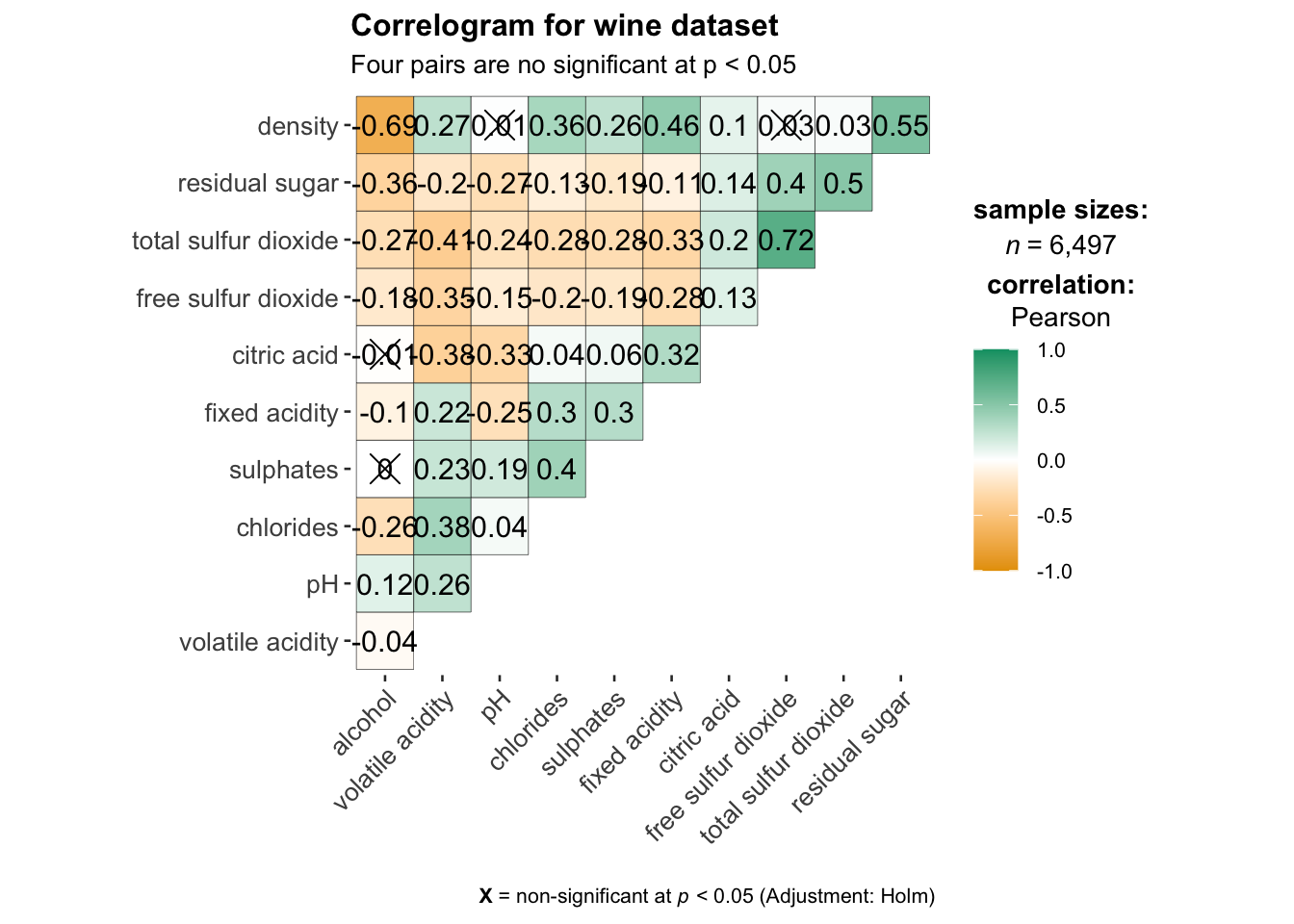
#help to control specific component of the plot such
ggplot.component = list(
    theme(text=element_text(size=5),
      axis.text.x = element_text(size = 8),
      axis.text.y = element_text(size = 8)))
2. Plotting Correlation Matrix: ggcormat()
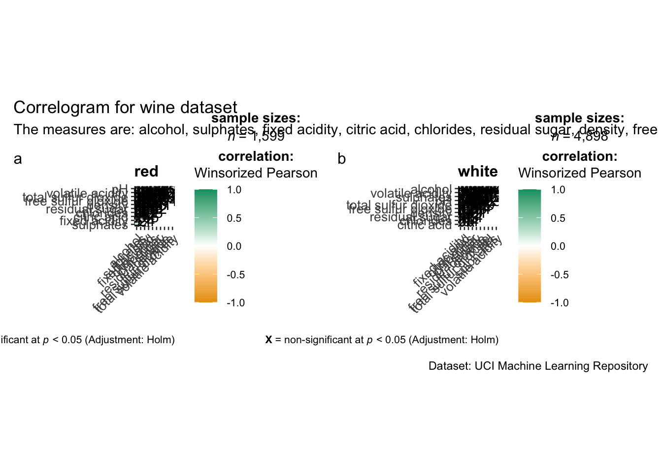
ggstatsplot package supports faceting. However the feature is not available in ggcorrmat() but in the grouped_ggcorrmat() of ggstatsplot.
#|fig.height: 12
#|fig.width: 6
grouped_ggcorrmat(
  data = wine,
  cor.vars = 1:11,
  grouping.var = type,        #to build facet plot
  type = "robust",
  p.adjust.method = "holm",

  #provides list of additional arguments
  plotgrid.args = list(ncol = 2),
  ggcorrplot.args = list(outline.color = "black",
                         hc.order = TRUE,
                         tl.cex = 10),

  #calling plot annotations arguments of patchwork
  annotation.args = list(
    tag_levels = "a",
    title = "Correlogram for wine dataset",
    subtitle = "The measures are: alcohol, sulphates, fixed acidity, citric acid, chlorides, residual sugar, density, free sulfur dioxide and volatile acidity",
    caption = "Dataset: UCI Machine Learning Repository"
  )
)
3. Plotting Corrplot package: corrplot()
We will be using corrplot() of the corrplot package. Check out -> An Introduction to corrplot Package for basic understanding of corrplot package.
wine.cor <- cor(wine[, 1:11])Next, corrplot() is used to plot the corrgram by using all the default setting as shown in the code chunk below.
corrplot(wine.cor)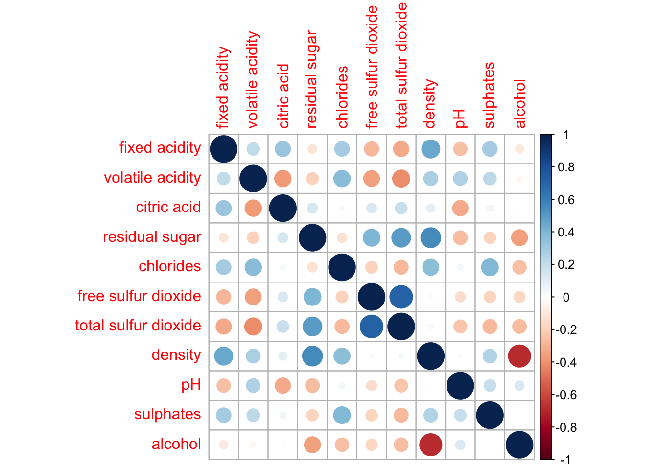
3.1 Further Visualization with Corrplot()
There are seven visual geometrics (parameter method) can be used to encode the attribute values. They are: circle, square, ellipse, number, shade, color and pie. The default is circle.
Example 1:
corrplot(wine.cor,
         method = "ellipse",  #default is circle
         type="lower",        #default is full
         diag = FALSE,        #turn off diagonal celss
tl.col = "black") #change axis text label color to black 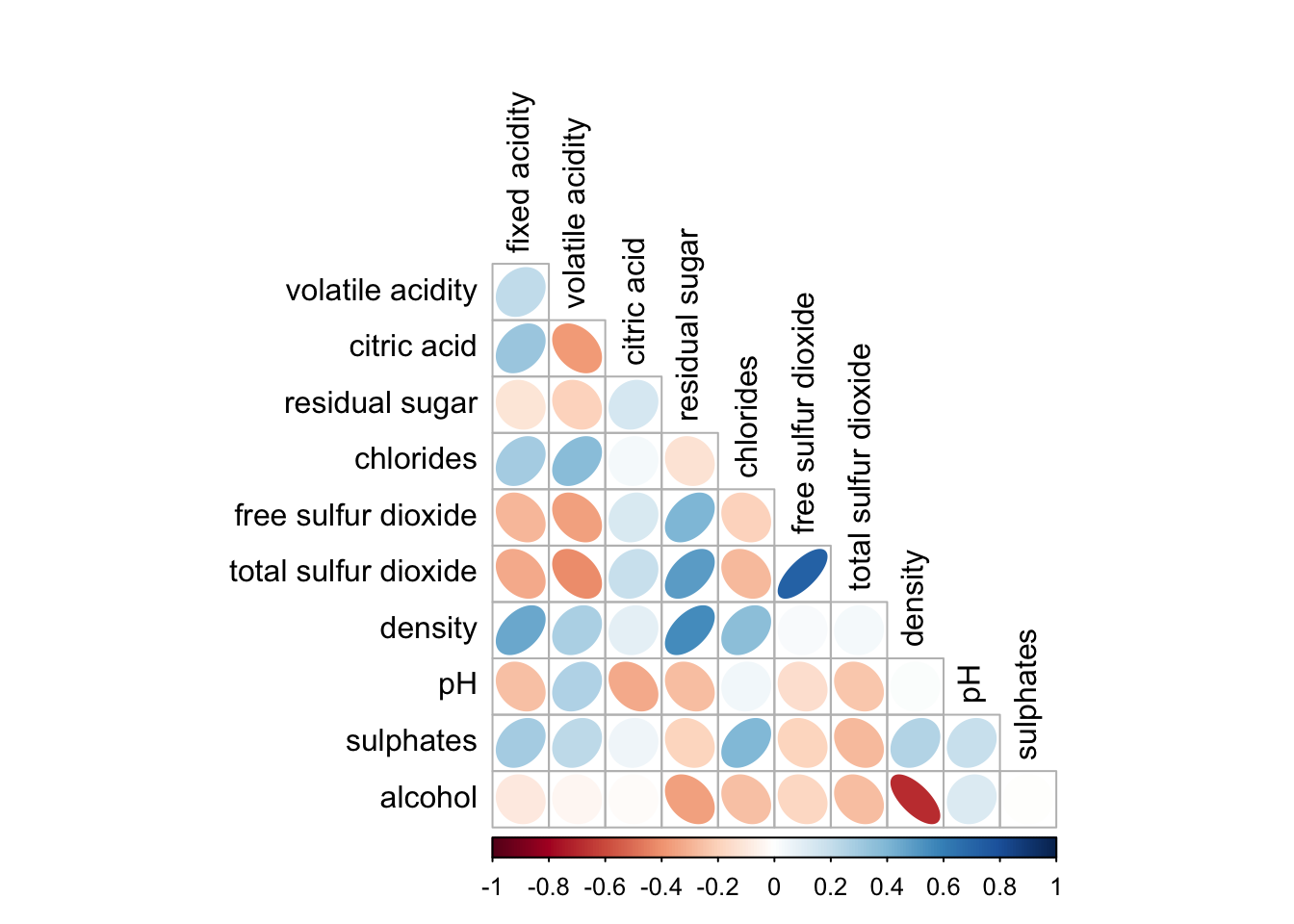
Example 2:
corrplot.mixed(wine.cor,
               lower = "ellipse",
               upper = "number",
               tl.pos = "lt",
               diag = "l",
               tl.col = "black")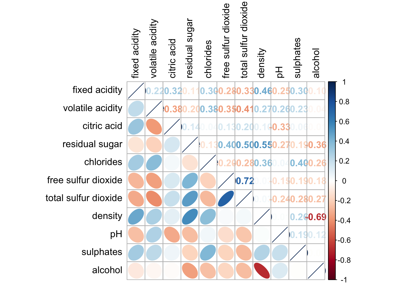
Example 3: Combine corrgram with significant test
wine.sig = cor.mtest(wine.cor, conf.level= .95)corrplot(wine.cor,
method = "number",
type = "lower",
diag = FALSE,
tl.col = "black",
tl.srt = 45,
p.mat = wine.sig$p, #input the calculated conf.level
sig.level = .05)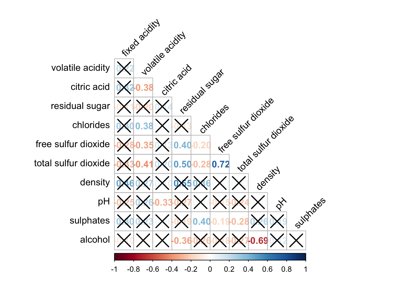
Reordering corrgram:
Matrix reorder is very important for mining the hiden structure and pattern in a corrgram. By default, the order of attributes of a corrgram is sorted according to the correlation matrix (i.e. “original”). The default setting can be over-write by using the order argument of corrplot(). Currently, corrplot package support four sorting methods, they are:
“AOE” is for the angular order of the eigenvectors. See Michael Friendly (2002) for details.
“FPC” for the first principal component order.
“hclust” for hierarchical clustering order, and “hclust.method” for the agglomeration method to be used.
- “hclust.method” should be one of “ward”, “single”, “complete”, “average”, “mcquitty”, “median” or “centroid”.
“alphabet” for alphabetical order.
“AOE”, “FPC”, “hclust”, “alphabet”. More algorithms can be found in seriation package.
corrplot.mixed(wine.cor,
               lower = "ellipse",
               upper = "number",
               tl.pos = "lt",
               diag = "l",        #instead of diag, change to order = "hclust"
               order="AOE",   #order_type.  then hcluster.method = "ward.D"
               tl.col = "black")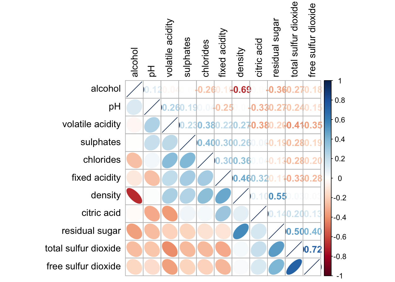
4. Plotting Heatmap
- Using p_load() of pacman package to load the required libraries
pacman::p_load(seriation, dendextend, heatmaply, tidyverse)- Importing data
wh <- read_csv("data/WHData-2018.csv")- Preparing the data
row.names(wh) <- wh$Country- Transform to Matrix
wh1 <- dplyr::select(wh, c(3, 7:12))
wh_matrix <- data.matrix(wh)
4.1 heatmap() of R Stats
We will be using heatmap() of Base Stats.
wh_heatmap <- heatmap(wh_matrix,
                      Rowv=NA, Colv=NA)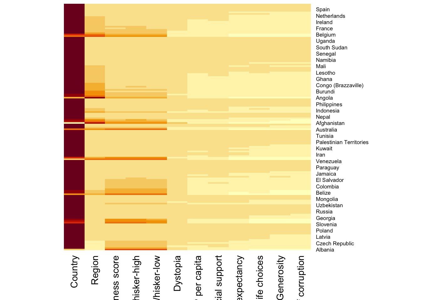
To plot cluster heatmap,
wh_heatmap <- heatmap(wh_matrix)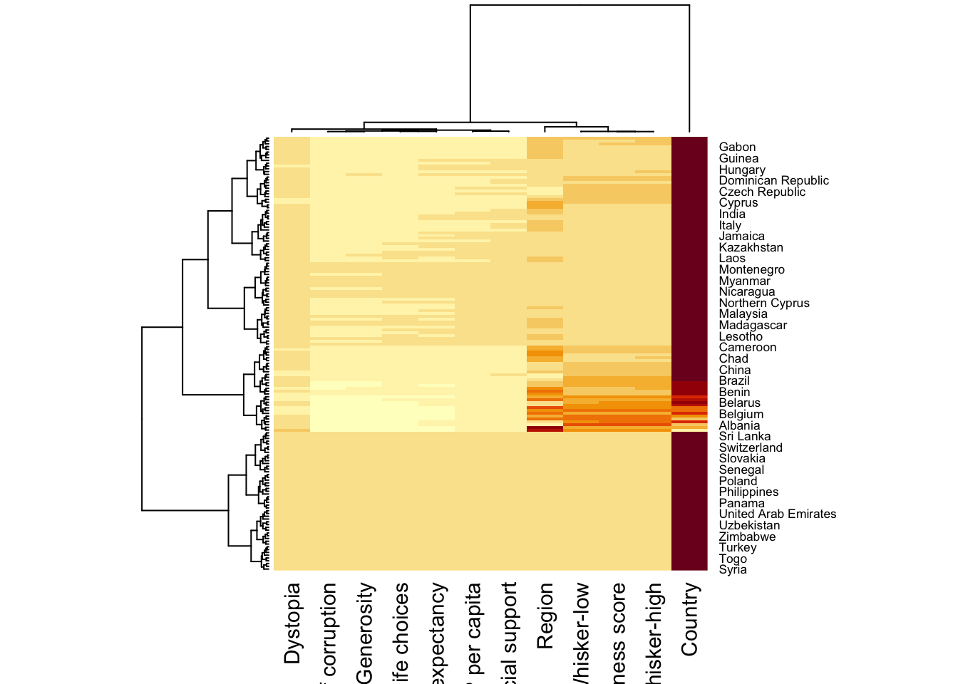
4.2 Interactive Heatmap
We will be using heatmaply in this section.
heatmaply supports a variety of hierarchical clustering algorithm. The main arguments provided are:
distfun: function used to compute the distance (dissimilarity) between both rows and columns. Defaults to dist. The options “pearson”, “spearman” and “kendall” can be used to use correlation-based clustering, which uses as.dist(1 - cor(t(x))) as the distance metric (using the specified correlation method).
hclustfun: function used to compute the hierarchical clustering when Rowv or Colv are not dendrograms. Defaults to hclust.
dist_method default is NULL, which results in “euclidean” to be used. It can accept alternative character strings indicating the method to be passed to distfun. By default distfun is “dist”” hence this can be one of “euclidean”, “maximum”, “manhattan”, “canberra”, “binary” or “minkowski”.
hclust_method default is NULL, which results in “complete” method to be used. It can accept alternative character strings indicating the method to be passed to hclustfun. By default hclustfun is hclust hence this can be one of “ward.D”, “ward.D2”, “single”, “complete”, “average” (= UPGMA), “mcquitty” (= WPGMA), “median” (= WPGMC) or “centroid” (= UPGMC).
Clustering: Manual Approach
In the code chunk below, the heatmap is plotted by using hierachical clustering algorithm with “Euclidean distance” and “ward.D” method.
heatmaply(normalize(wh_matrix[, -c(1, 2, 4, 5)]),
          dist_method = "euclidean",
          hclust_method = "ward.D")
Clustering: Statistical Approach
In order to determine the best clustering method and number of cluster the dend_expend() and find_k() functions of dendextend package will be used.
First, the dend_expend() will be used to determine the recommended clustering method to be used.
wh_d <- dist(normalize(wh_matrix[, -c(1, 2, 4, 5)]), method = "euclidean")
dend_expend(wh_d)[[3]]
dist_methods hclust_methods optim
1 unknown ward.D 0.6137851
2 unknown ward.D2 0.6289186
3 unknown single 0.4774362
4 unknown complete 0.6434009
5 unknown average 0.6701688
6 unknown mcquitty 0.5020102
7 unknown median 0.5901833
8 unknown centroid 0.6338734The output table shows that “average” method should be used because it gave the high optimum value.
Next, find_k() is used to determine the optimal number of cluster.
wh_clust <- hclust(wh_d, method = "average")
num_k <- find_k(wh_clust)
plot(num_k)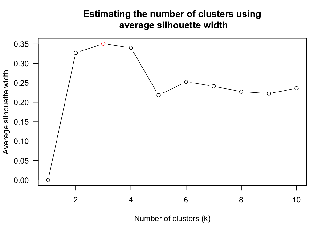
Figure above shows that k=3 would be good.
With reference to the statistical analysis results, we can prepare the code chunk as shown below.
heatmaply(normalize(wh_matrix[, -c(1, 2, 4, 5)]),
          dist_method = "euclidean",
          hclust_method = "average",
          k_row = 3)
Seriation:
heatmaply uses the seriation package to find an optimal ordering of rows and columns.
heatmaply(normalize(wh_matrix[, -c(1, 2, 4, 5)]),
          seriate = "OLO")
The default options is “OLO” (Optimal leaf ordering) which optimizes the above criterion (in O(n^4)). Another option is “GW” (Gruvaeus and Wainer) which aims for the same goal but uses a potentially faster heuristic.
Final outcome:
heatmaply(normalize(wh_matrix[, -c(1, 2, 4, 5)]),
          Colv=NA,
          seriate = "none",
          colors = Blues,
          k_row = 5,
          margins = c(NA,200,60,NA),
          fontsize_row = 4,
          fontsize_col = 5,
          main="World Happiness Score and Variables by Country, 2018 \nDataTransformation using Normalise Method",
          xlab = "World Happiness Indicators",
          ylab = "World Countries"
          )
5. Plotting parallel coordinates
wh <- read_csv("data/WHData-2018.csv")5.1 With box plot
Refer to url for more explanation.
ggparcoord(data = wh,
           columns = c(7:12),
           groupColumn = 2,
           scale = "uniminmax",
           alphaLines = 0.2,
           boxplot = TRUE,
           title = "Parallel Coordinates Plot of World Happines Variables")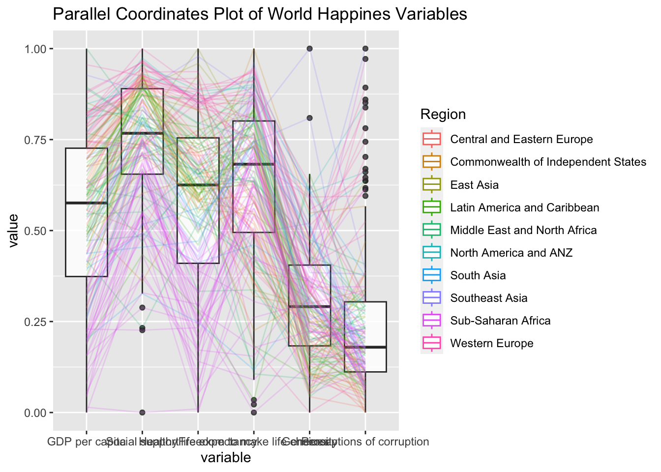
5.2 With Facet Wrap
ggparcoord(data = wh,
           columns = c(7:12),
           groupColumn = 2,
           scale = "uniminmax",
           alphaLines = 0.2,
           boxplot = TRUE,
           title = "Multiple Parallel Coordinates Plots of World Happines Variables by Region") +
  facet_wrap(~ Region)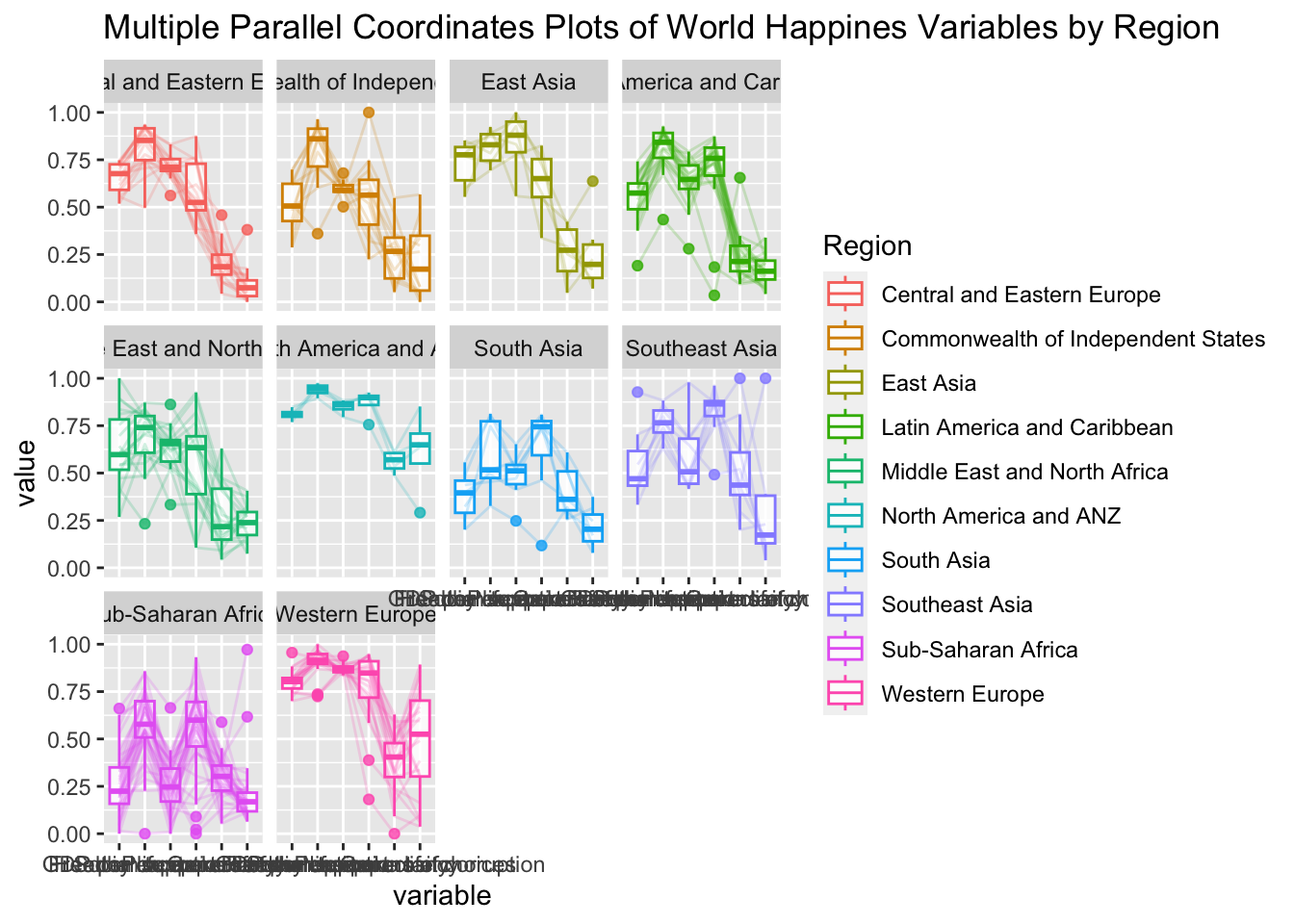
5.3 Interactive Parallel Coordinates Plot
parallelPlotis used in this section.
wh_i <- wh |>
  select("Happiness score", c(7:12))
histo <- rep(TRUE, ncol(wh_i))
parallelPlot(wh_i,
continuousCS = "YlOrRd",
rotateTitle = TRUE,
histoVisibility = histo)6. Plotting treemap
Grouped summaries with pipe
realis2018_summarised <- realis2018 %>%
  group_by(`Project Name`,`Planning Region`,
           `Planning Area`, `Property Type`,
           `Type of Sale`) %>%
  summarise(`Total Unit Sold` = sum(`No. of Units`, na.rm = TRUE),
            `Total Area` = sum(`Area (sqm)`, na.rm = TRUE),
            `Median Unit Price ($ psm)` = median(`Unit Price ($ psm)`, na.rm = TRUE),
            `Median Transacted Price` = median(`Transacted Price ($)`, na.rm = TRUE))
Thereafter, we filter for condominium in property type and resale type of flat.
realis2018_selected <- realis2018_summarised %>%
  filter(`Property Type` == "Condominium", `Type of Sale` == "Resale")
As the file have been installed previous in Take Home Exercise 2, we will not install the github again.
#library(devtools)
#install_github("timelyportfolio/d3treeR")

library(d3treeR) #package have been installed in Take Home Exercise 2
6.1 Plotting interactive treemap with d3treeR
tm <- treemap(realis2018_summarised,
        index=c("Planning Region", "Planning Area"),
        vSize="Total Unit Sold",
        vColor="Median Unit Price ($ psm)",
        type="value",
        title="Private Residential Property Sold, 2017",
        title.legend = "Median Unit Price (S$ per sq. m)"
        )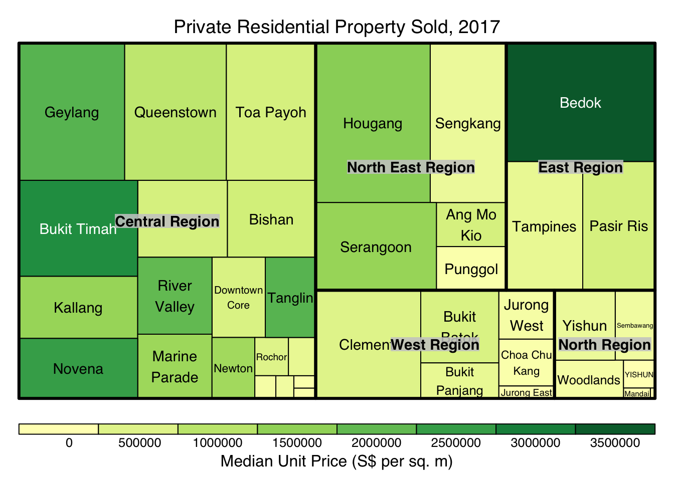
d3tree(tm,rootname = "Singapore" )