pacman::p_load(rstatix,gt,patchwork,tidyverse,webshot2,png)In-class Exercise 4
Getting started
- Using p_load() of pacman package to load the required libraries
- Importing data
exam_data <- read_csv("data/Exam_data.csv")Plotting the graph
1) Visualizing statistical graph QQ Plot
The quantile-quantile (q-q) plot is a graphical technique for determining if two data sets come from populations with a common distribution.
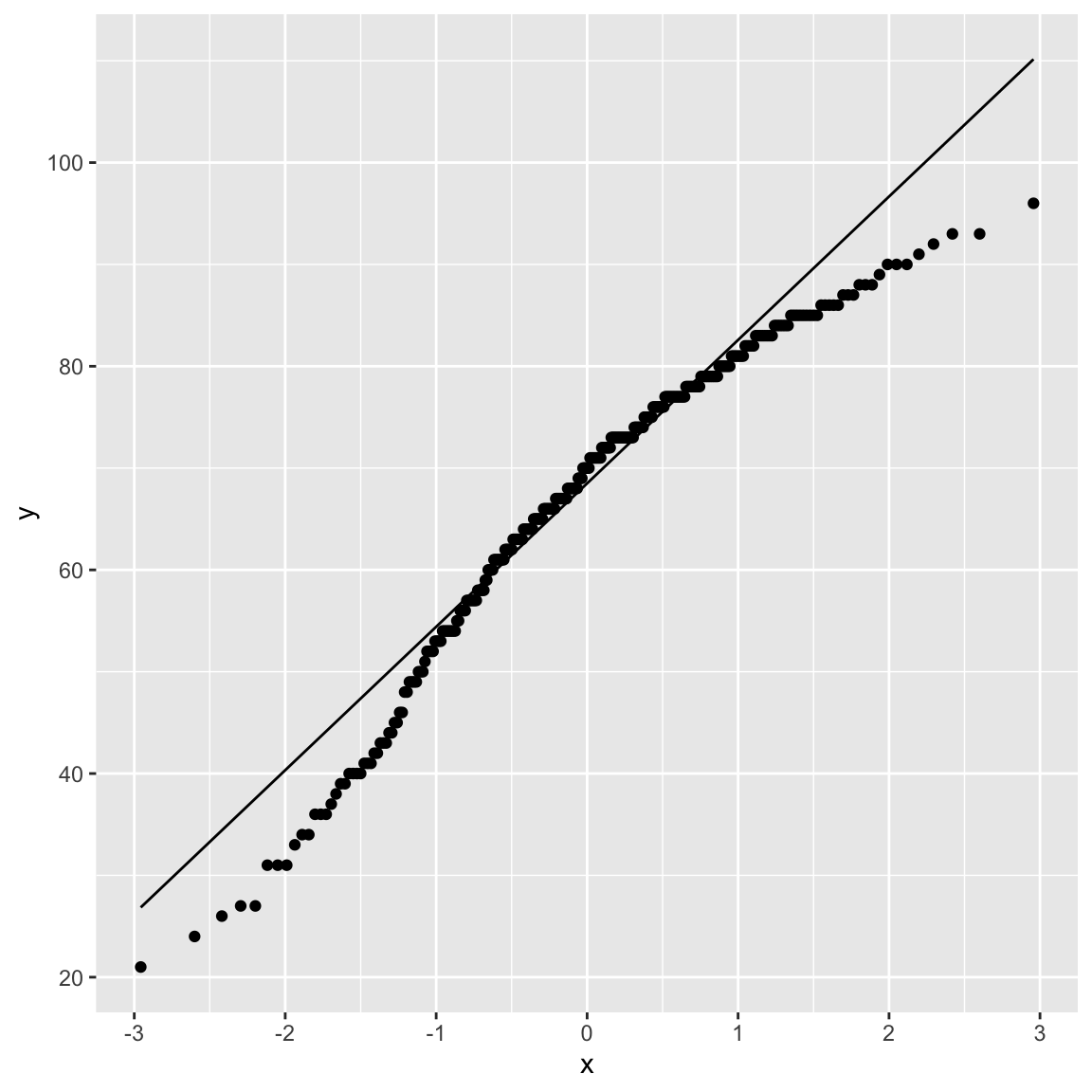
ggplot(exam_data,
       aes(sample=ENGLISH)) +
  stat_qq() +
  stat_qq_line()
2) Combining statistical graph and analysis table
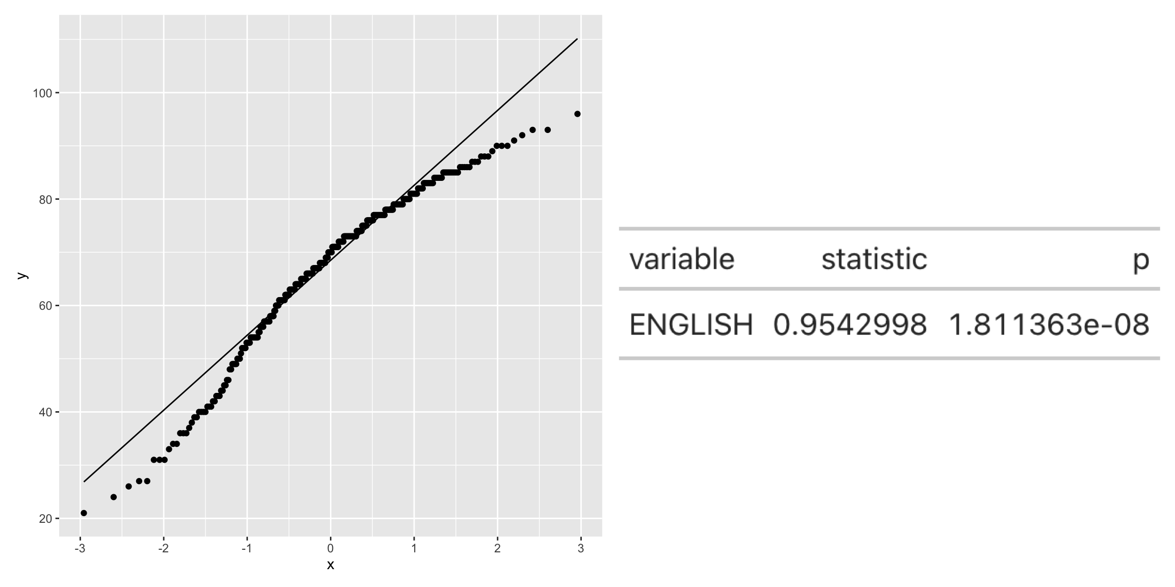
qq <- ggplot(exam_data,
       aes(sample=ENGLISH)) +
  stat_qq() +
  stat_qq_line()

sw_t <- exam_data %>%
  shapiro_test(ENGLISH) %>%
  gt()

tmp <-tempfile(fileext = ".png")
gtsave(sw_t,tmp)
table_png <- png::readPNG(tmp,
native= TRUE)

qq + table_png